
Mar 24, 2013
The "collected edition" cover
I guess I will try to collect this 3-part tale in a single volume and put it up on IndyPlanet. Here is the cover I came up with for that version:


Mar 14, 2013
Holy Nib pt. 3 (of 3)
Finally finished this 3-part series. Part 3 is 10 magazine-sized b&w pages, so all told it's around 33, 34 pages (Parts 1 and 2 each ran a little longer.) Quite a relief to be able to get on to other projects, other ideas. Here's the cover and some selected (non-consecutive) pages:


Feb 21, 2013
piddling: the 9th top secret for making top comics
Forget what you thought you knew about piddling - this essay blows the lid off all that came before and gives you an insight into the piddler's inner zen (or inner pid if you will.) Note: if you're looking for information about puddlers, see our section on the early 20th century steel industry.
 I think it was an essay by Joe Bageant (most famous for his book "Deer hunting w Jesus") that first made me give some thought to what piddling was, and whether I myself was a piddler. At that time I concluded that for the most part, while I had nothing against piddlers or piddling, it wasn't really something I had a natural affinity for. You have to be slightly older than myself maybe, more at peace with the universe and (perhaps most importantly) have a garage, in order to spend time out in the garage sorting one's trout lures, or whatever else the piddler does when he piddles.
Nevertheless I realized today that there may
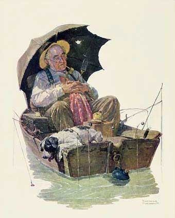 I think it was an essay by Joe Bageant (most famous for his book "Deer hunting w Jesus") that first made me give some thought to what piddling was, and whether I myself was a piddler. At that time I concluded that for the most part, while I had nothing against piddlers or piddling, it wasn't really something I had a natural affinity for. You have to be slightly older than myself maybe, more at peace with the universe and (perhaps most importantly) have a garage, in order to spend time out in the garage sorting one's trout lures, or whatever else the piddler does when he piddles.
 Nevertheless I realized today that there may
Feb 9, 2013
The Extraordinary Wonderosity of Science
I just did some illustrations for UAB Magazine, a local university publication. The article was about various programs UAB and other institutions are starting to try to spark an interest in science among kids.


And here's a partial sketch of one before color:


And here's a partial sketch of one before color:

Dec 6, 2012
Christmas card commission
Recent caricature commission the client plans to use on their Christmas cards. I used a different pen than I usually do. It's a disposable drawing pen but the tip is sort of like a dip pen - slightly chisel-tipped and with some flexibility. It's from Pentel, I think they call it Pentel Sketch. Then I used Prismacolor markers for the color. Kind of a corny drawing style, but that seems to be my natural inclination, I guess I shouldn't fight it...


Dec 3, 2012

Nov 27, 2012
Garrison on "Holy Nib" Pt. 1
My friend Chris Garrison sent me this nice "review"/critique of "Pete Moss" #1 a while back and it just occurred to me to post it here for others to enjoy. You can see pages from the comic here. Also be sure to check out Chris's weekly comic on Sundays at dummcomics.com.
[...] It was neat that the cover was a real scene from the story, but then when I read that scene, it was kind of weird that there wasn't a big splash panel or something as spectacular as the cover image.
I
love all the architectural flourishes throughout, like the things
around the balcony on the cover, plants, carpet patterns, etc. Lovely.
Reminds me of Winsor McKay.
All those panels
in the top 2 tiers of page 1 are awesome. They look so perfect and
classic. Especially the 1st one on the top tier, and the 1st one on the
2nd tier. And the 1st 2 panels on page 2. And I love this scritchy
little line, that makes it look like a 1923 strip or something. Like
Lyonel Feininger.
I don't mind that there are
some thick and thin lines throughout, but to keep that cool look, I'd
use the thick more sparingly, and only with purpose. Like, to put
something clearly in the foreground, thicken it, but don't have
senseless thick lines, and definitely try to avoid thick lines on
something far away,
Subscribe to:
Posts (Atom)