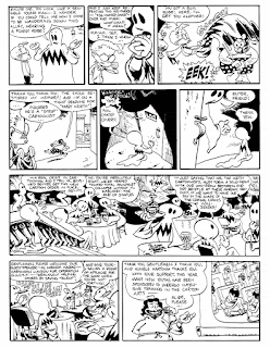
My friend Chris Garrison sent me this nice "review"/critique of "Pete Moss" #1 a while back and it just occurred to me to post it here for others to enjoy. You can see pages from the comic here. Also be sure to check out Chris's weekly comic on Sundays at dummcomics.com.
[...] It was neat that the cover was a real scene from the story, but then when I read that scene, it was kind of weird that there wasn't a big splash panel or something as spectacular as the cover image.
I
love all the architectural flourishes throughout, like the things
around the balcony on the cover, plants, carpet patterns, etc. Lovely.
Reminds me of Winsor McKay.
All those panels
in the top 2 tiers of page 1 are awesome. They look so perfect and
classic. Especially the 1st one on the top tier, and the 1st one on the
2nd tier. And the 1st 2 panels on page 2. And I love this scritchy
little line, that makes it look like a 1923 strip or something. Like
Lyonel Feininger.
I don't mind that there are
some thick and thin lines throughout, but to keep that cool look, I'd
use the thick more sparingly, and only with purpose. Like, to put
something clearly in the foreground, thicken it, but don't have
senseless thick lines, and definitely try to avoid thick lines on
something far away,


