These are some designs I did for a local screenprinter that does a lot of high school homecoming shirts. The highschoolers come up with the ideas. I draw them. Then the screenprinter colors them and (usually) adds the text in house.
I'm not sure why the Brave in this one is in a pit in addition to being burned alive. The concepts are just passed on to me as written notes and usually the screenprinter doesn't know any more than I do. I guess it could be intended just as additional ignominy for their foes.
In this one I added text just to show their designer how I envisioned its placement. Also, on my original sketch I had the alligator looking sort of dopey and happy. But word came back that the client wanted there to be across-the-board menace, which is understandable. I was a little on the fence about the dopey alligator version myself.
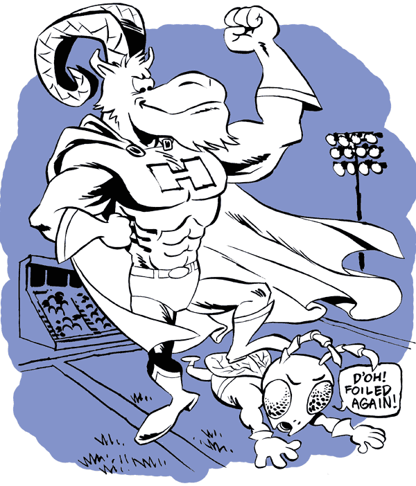
As with the text in the one above, the color here was just a "sketch" to show what I had in mind for the background - separating it from the foreground with one (or two) simple colors, plus using the color to create a ragged border. Another change from the client came back on this one - I had originally written "Curses! Foiled again!" in the villain's speech balloon, but an alert teacher must have vetoed that. Whether out of personal sensitivity or a finely honed awareness of the sensitivity of parents, we can only speculate.
The text here was going to be "GMO the Jets!" I think but --- oh wait, my bad, it was actually for a chemistry class celebrating a chemical holiday of some sort.
Well that's all I've got, now go get 'em, team!


These are great! I imagine "Curses! Foiled again!" was changed because maybe nobody under 30 knows that expression.
ReplyDelete