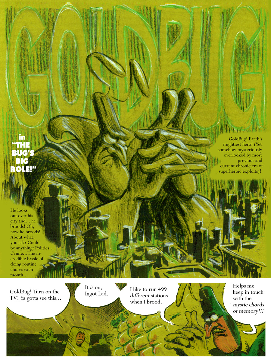
What happened? What were you thinking, Mister Rocks? My precious GoldBug, all tarnished and green-looking. Glorious Green-O-Vision, huh?
My, my, my. . . and that lettering? What is that? That's not what I'm used to seeing, here. Did you break out an old typewriter or something? This madness has to stop.
!STOP!
Your brilliance escapes me. You're this uber-talented artistic being, and yet, you butcher your own work with you own artistic-dimensional tinkering. Who asked for glorious Green-O-Vision? Exactly no one, and here you go and unleash the green cat out of the bag.
And the green cat has shed its fur all over the place, all over this newest installment in the GoldBug Escapades series. The lettering I hate more than the green tint gone to Visual Hell. You're a competent, capable hand-letterer, so whatever were you thinking, Tim?
Now, I will be the very first to admit that I love the big, brooding GoldBug in the first panel, up there. His image towers over the city, below. That's a good opening visual shot.
Aliens invading - I can go with that. I can roll right along with that, Tim. Would I buy this GoldBug meets pea soup stuff, though? Very doubtful.
Very. Doubtful.
Who is going to buy that, pray tell me? Is there a large black market for pea soup-colored comic books, these days? Maybe I'm out of the loop on this one, but you're taking my favorite character out of all of your artistic creations that I have encountered, to date, and you're running over him with an artistic steam roller.
At some point as you're reading this, the inner you in you hopes - nay, prays - that the green fog will break, and that GoldBug will be freed from this visual quagmire that you've plopped him down in to. Hey, Tim, if I ever mentioned that I would love for you to convert GoldBug into GreenBug, then know right now that I'm really sorry for saying that.
You've heard of too much of a good thing? Well, this ain't it, buddy. No, this right here is something else, altogether.
Maybe the green represents GoldBug's mood, his mood when he broods. OK, I get that. But, readers aren't going to go for this, not in this day and age. There are reasons why people do not fork over good money for comic books that remind them of television sets with the color tube on the fritz.
And the story? Well, who can focus upon the story, when their eyes keep on rebelling at what lies before them? I just don't understand why you chose muted visuals to eye-grabbing glory? It has a drab effect. Its gloom matches what I feel, trying to keep up with GoldBug on Planet GreenHell.
The more that you develop GreenBug, the more serious a tone that he takes on. He's gone from being the next Scrooge McDuck to being Peter Graves. Don't ask me what I mean by that, either. It's just something that crossed my mind, and it sounded good, so I went with it. That's all.
These pages' lettering is visual heresy. One of the things that really draws me to your work, aside from the fact that you pay me to read it (Hah!), is that you are a multi-talented maestro of the comic book arts. You draw, you color, you letter. You're a master craftsman of your profession - yet as these green-saturated pages clearly reveal, you're also dangerous to your own work when left alone for too long a period of time.
Or put another way, your artistic genius exceeds my ability to grasp - much less appreciate - it.
I'm going to go to bed, now, depressed and thinking of the color green.


Holy mother of God!
ReplyDeleteWhat happened? What were you thinking, Mister Rocks? My precious GoldBug, all tarnished and green-looking. Glorious Green-O-Vision, huh?
My, my, my. . . and that lettering? What is that? That's not what I'm used to seeing, here. Did you break out an old typewriter or something? This madness has to stop.
!STOP!
Your brilliance escapes me. You're this uber-talented artistic being, and yet, you butcher your own work with you own artistic-dimensional tinkering. Who asked for glorious Green-O-Vision? Exactly no one, and here you go and unleash the green cat out of the bag.
And the green cat has shed its fur all over the place, all over this newest installment in the GoldBug Escapades series. The lettering I hate more than the green tint gone to Visual Hell. You're a competent, capable hand-letterer, so whatever were you thinking, Tim?
Now, I will be the very first to admit that I love the big, brooding GoldBug in the first panel, up there. His image towers over the city, below. That's a good opening visual shot.
Aliens invading - I can go with that. I can roll right along with that, Tim. Would I buy this GoldBug meets pea soup stuff, though? Very doubtful.
Very. Doubtful.
Who is going to buy that, pray tell me? Is there a large black market for pea soup-colored comic books, these days? Maybe I'm out of the loop on this one, but you're taking my favorite character out of all of your artistic creations that I have encountered, to date, and you're running over him with an artistic steam roller.
At some point as you're reading this, the inner you in you hopes - nay, prays - that the green fog will break, and that GoldBug will be freed from this visual quagmire that you've plopped him down in to. Hey, Tim, if I ever mentioned that I would love for you to convert GoldBug into GreenBug, then know right now that I'm really sorry for saying that.
You've heard of too much of a good thing? Well, this ain't it, buddy. No, this right here is something else, altogether.
Maybe the green represents GoldBug's mood, his mood when he broods. OK, I get that. But, readers aren't going to go for this, not in this day and age. There are reasons why people do not fork over good money for comic books that remind them of television sets with the color tube on the fritz.
And the story? Well, who can focus upon the story, when their eyes keep on rebelling at what lies before them? I just don't understand why you chose muted visuals to eye-grabbing glory? It has a drab effect. Its gloom matches what I feel, trying to keep up with GoldBug on Planet GreenHell.
The more that you develop GreenBug, the more serious a tone that he takes on. He's gone from being the next Scrooge McDuck to being Peter Graves. Don't ask me what I mean by that, either. It's just something that crossed my mind, and it sounded good, so I went with it. That's all.
These pages' lettering is visual heresy. One of the things that really draws me to your work, aside from the fact that you pay me to read it (Hah!), is that you are a multi-talented maestro of the comic book arts. You draw, you color, you letter. You're a master craftsman of your profession - yet as these green-saturated pages clearly reveal, you're also dangerous to your own work when left alone for too long a period of time.
Or put another way, your artistic genius exceeds my ability to grasp - much less appreciate - it.
I'm going to go to bed, now, depressed and thinking of the color green.