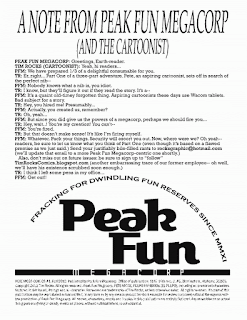
Recent caricature commission the client plans to use on their Christmas cards. I used a different pen than I usually do. It's a disposable drawing pen but the tip is sort of like a dip pen - slightly chisel-tipped and with some flexibility. It's from Pentel, I think they call it Pentel Sketch. Then I used Prismacolor markers for the color. Kind of a corny drawing style, but that seems to be my natural inclination, I guess I shouldn't fight it...
"All the latest drippings from Tim's grease-pan of deep-fried cartoon delectables!!"
Dec 6, 2012
Dec 3, 2012
Nov 27, 2012
Garrison on "Holy Nib" Pt. 1
My friend Chris Garrison sent me this nice "review"/critique of "Pete Moss" #1 a while back and it just occurred to me to post it here for others to enjoy. You can see pages from the comic here. Also be sure to check out Chris's weekly comic on Sundays at dummcomics.com.
[...] It was neat that the cover was a real scene from the story, but then when I read that scene, it was kind of weird that there wasn't a big splash panel or something as spectacular as the cover image.
I
love all the architectural flourishes throughout, like the things
around the balcony on the cover, plants, carpet patterns, etc. Lovely.
Reminds me of Winsor McKay.
All those panels
in the top 2 tiers of page 1 are awesome. They look so perfect and
classic. Especially the 1st one on the top tier, and the 1st one on the
2nd tier. And the 1st 2 panels on page 2. And I love this scritchy
little line, that makes it look like a 1923 strip or something. Like
Lyonel Feininger.
I don't mind that there are
some thick and thin lines throughout, but to keep that cool look, I'd
use the thick more sparingly, and only with purpose. Like, to put
something clearly in the foreground, thicken it, but don't have
senseless thick lines, and definitely try to avoid thick lines on
something far away,
Nov 19, 2012
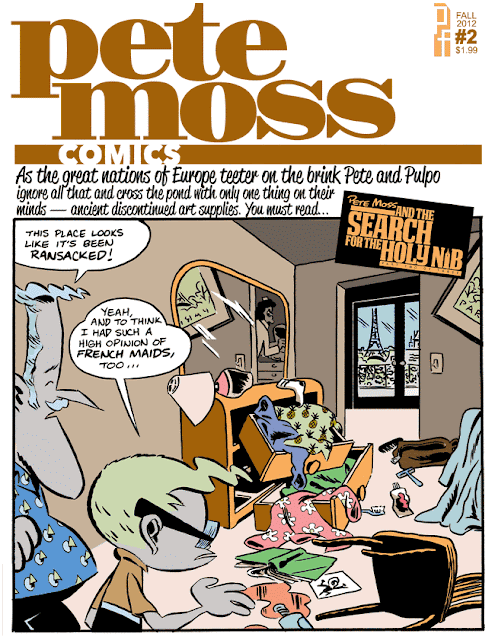
Pete Moss #2
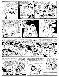
Finished Part Two of my 3-part tale, "The Search for the Holy Nib" (Part One here.) As usual all that means is I'll print out a number of copies and give them to people I know, or put them in some local stores, or perhaps send some to small publishers, or take some to small press shows, or... whatever else I think of. I get a kick out of seeing the printed and stapled copies myself anyway.
Here's the cover and first few pages:
Here's the cover and first few pages:
Oct 31, 2012
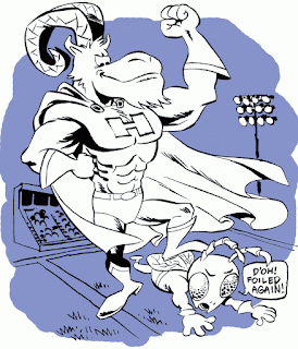
PLAY BALL!!
I'm not sure why the Brave in this one is in a pit in addition to being burned alive. The concepts are just passed on to me as written notes and usually the screenprinter doesn't know any more than I do. I guess it could be intended just as additional ignominy for their foes.
In this one I added text just to show their designer how I envisioned its placement. Also, on my original sketch I had the alligator looking sort of dopey and happy. But word came back that the client wanted there to be across-the-board menace, which is understandable. I was a little on the fence about the dopey alligator version myself.
As with the text in the one above, the color here was just a "sketch" to show what I had in mind for the background - separating it from the foreground with one (or two) simple colors, plus using the color to create a ragged border. Another change from the client came back on this one - I had originally written "Curses! Foiled again!" in the villain's speech balloon, but an alert teacher must have vetoed that. Whether out of personal sensitivity or a finely honed awareness of the sensitivity of parents, we can only speculate.
Well that's all I've got, now go get 'em, team!
Oct 12, 2012
State of the Stands (Oct '12)
We now present some important observations gleaned from a quick perusal of the comic book racks...
Francesco Francavilla's comic art has a level of detail about like old 30s comics, but he uses more modern fancy layouts. His coloring is very "artistic" too, not the typical overdone computer coloring - it's minimal like the drawing, with occasional unexpected color choices punching it up.
Alan Davis (does he go back to the 70s? Seems like I've seen the name in old X-men comics) has a 3-part series running thru several of Marvel's "annuals" that looks good. It seems like a more 70s style
Aug 28, 2012
Pete Moss Comics #1 - Preview Pages
Here's a short preview (with new cover design.) I'm now offering the comic (11 dense magazine size pages) for $1.99 as a PDF (use Paypal button at right and provide your email address in the "notes" section.) OR, you can get it FREE in exchange for a review, letter of comment, or critique that you post to some public comic forum and link to me. Positive or negative reviews accepted. Just send me an email to the address at right, and I will send you the PDF to read and review.
Click to enlarge:
Click to enlarge:
Jun 28, 2012
"8-bit" Illustrations
Here's some material UAB Magazine commissioned for an article about local students and faculty who fight computer crime. They wanted to give it the "8-bit" (or maybe even 4-bit) look of old video-games. This one is an early version that strayed too far from the 8-bit concept, so
Jun 12, 2012
New Comic: Pete Moss and the Search for the Holy Nib
Part One of Three is finished. Here's the cover:
Pete Moss, an aspiring cartoonist, gets frustrated with his tools and sets out in search of the perfect nib. He tracks down his hero, Pulpo Papierios, at a comic convention and pesters him about his "line quality". Meanwhile, he's pursued by mysterious agents of a foreign power, and Pulpo seems to be mixed up in some sort of cult. It's all very droll.
Some random scenes/previews:
I xeroxed a small batch to give to friends and fellow cartoonists locally. If anyone in the wide world is interested, I suppose just paypal five bucks to rocksgraphic@hotmail.com and I'll mail one out to you. Right now though I'm mainly just showing it to people locally and looking to get some audience feedback that way.
May 22, 2012
Down Home Southern Fried Caricatures
Another recent caricature commission from down heah in the Heart of Dixie:
If you would like a watercolor caricature to frame and give to your friend or loved one on some special occasion, contact me, Tim Rocks, with your initial ideas. Email rocksgraphic@hotmail.com or you can also call 205-251-0763. I'm based in Birmingham, AL but can ship anywhere thanks to an extensive network of roads that lead right up to my shack.
If you would like a watercolor caricature to frame and give to your friend or loved one on some special occasion, contact me, Tim Rocks, with your initial ideas. Email rocksgraphic@hotmail.com or you can also call 205-251-0763. I'm based in Birmingham, AL but can ship anywhere thanks to an extensive network of roads that lead right up to my shack.
May 1, 2012
Apr 21, 2012
The Time Has Come to Talk of Shrimp Pimps
For a friend of a friend's shrimp import business:
Here's the original sketch I did. I like the vinegar in this lettering, but it was difficult to ink by hand without wavering, so I found a font. Maybe I should have braved it and just left the imperfections.
Mar 25, 2012
How Webcrawlers Make the Web Worse
Reading about how to improve small business search rankings reveals the way webcrawler design leads businesses to create so-called "content" that does everyone a disservice --- both their own customers as well as people actually looking for useful information.
I started reading about "search engine optimization", or SEO, partly at the behest of my dad who's trying to improve his sign shop's website, but also to help with promoting the stuff I do. Anyway, SEO tends to be a lot of fairly boring technical little stuff, mainly about all the relentless ways you can squeeze in "keywords" and "keyphrases" into every last pixel of your site, for the benefit of Google's (and others') webcrawlers and "robots". But then it got interesting (or perhaps it only seemed so by comparison) when my RepKoverTM bound guidebook (lays flat for easy reading) started advising me to simulate "content" to draw in the flies --- to get some Content Management Software (CMS) and perhaps hire a copywriter to fob off some faux-info on the hoi polloi (assonant aside: I dream of one day opening a competitor to Hobby Lobby, either catty-corner or across the street, to be called The Hobber Lobber. Additional aside, non-assonant: perhaps these very words are only a content simulacrum, cynically generated to ensnare you in some commercial agenda?)Mar 4, 2012
Fancy Free (or Cheap Anyway) and Footloose
The world offers many paradoxes to the observant. I speak today of a certain foot-based conundrum that is once again upon me as spring and summer draw near. It first hit me last summer, and now I suppose it threatens to be an annual occurrence, barring a minor revolution in low-end footwear manufacturing practices.
Sandals, you see, apparently have to be "fancy" if they're also cheap. By "fancy", I mean they have to have elaborate leather (or leather-like?) strappage, with lots of buckles and doodads, and in general suggest that the wearer commands armies of Roman legionaires, or has servants who feed him grapes while he lies on one of his many divans. Then again, some of the designs cross that influence with a bit of standard 1990s "extreme" stylings, for the Roman emperor who also likes to drive 4-wheelers and stomp on small creatures from time to time.
Sandals, you see, apparently have to be "fancy" if they're also cheap. By "fancy", I mean they have to have elaborate leather (or leather-like?) strappage, with lots of buckles and doodads, and in general suggest that the wearer commands armies of Roman legionaires, or has servants who feed him grapes while he lies on one of his many divans. Then again, some of the designs cross that influence with a bit of standard 1990s "extreme" stylings, for the Roman emperor who also likes to drive 4-wheelers and stomp on small creatures from time to time.
Subscribe to:
Comments (Atom)


